
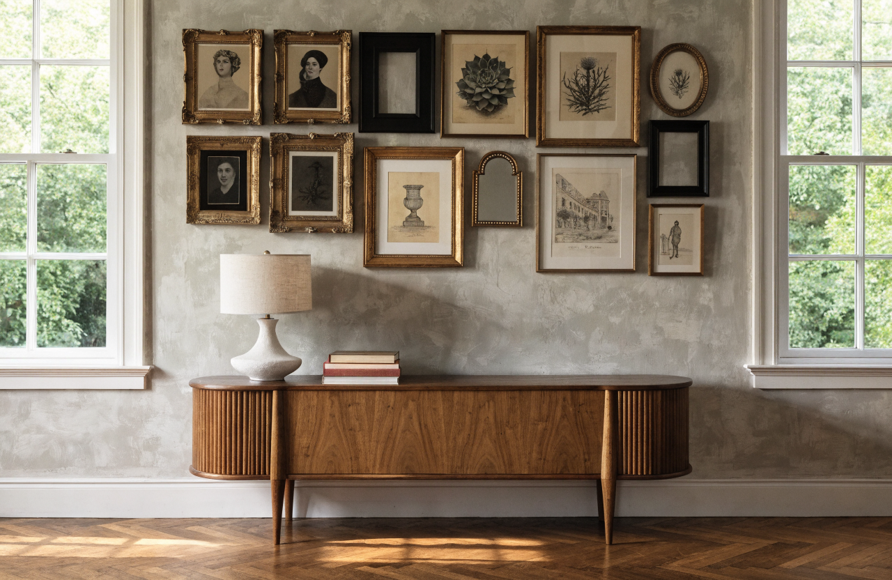
Your walls deserve better than a lonely frame and a dusty nail. A vintage gallery wall turns random treasures into a story you can literally stare at for hours.
We’re talking instant character, major charm, and that “Did you hire a designer?” energy. Ready to pick the perfect layout and make your walls do the most?
1. The Classic Grid That Never Quits
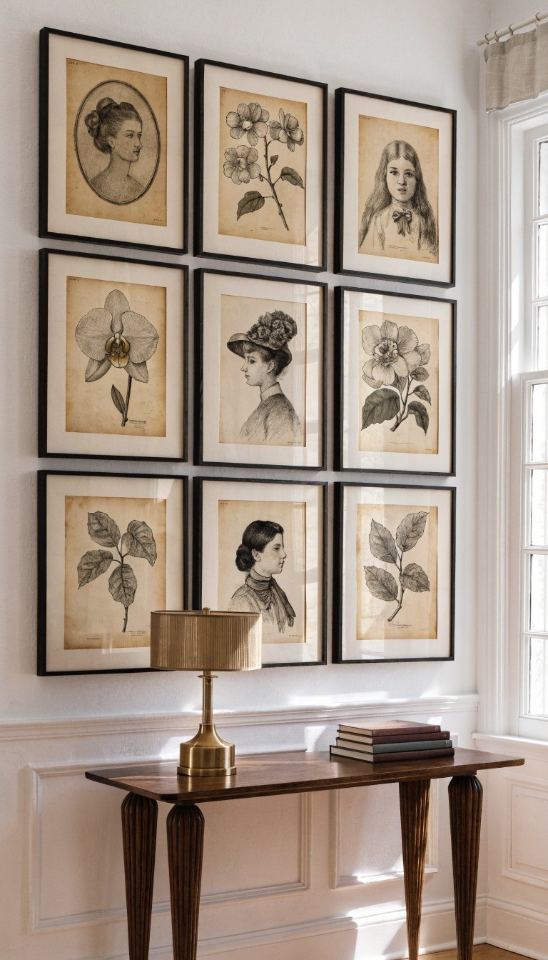
Want instant polish with zero chaos? A tight, even grid gives your vintage prints a crisp, gallery-grade look while letting the art do the talking. It works when you have similarly sized frames or a series, like botanical plates or sepia portraits.
Tips
- Use identical frames or matching finishes for cohesion.
- Mind the math: keep gaps even (try 2 inches/5 cm between frames).
- Hang center at eye level—roughly 57 inches/145 cm from the floor.
Choose this when you want order, symmetry, and a quietly confident vibe that suits dining rooms, hallways, and home offices.
2. The Salón Wall (A.K.A. Maximalist Magic)
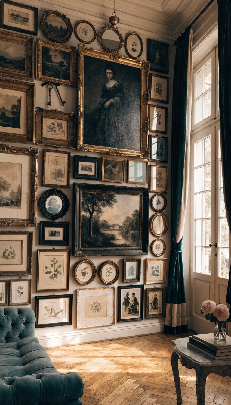
Think 19th-century Paris salon—floor to ceiling, all the drama. Mix paintings, etchings, silhouettes, and quirky finds like antique keys or tiny mirrors. The variety feels collected over decades, not just a frantic weekend at the flea market.
Key Moves
- Anchor with one or two larger pieces near the center.
- Mix frame materials: wood, gilt, black lacquer, even a chippy painted one.
- Balance shapes—sprinkle ovals and rounds between rectangles.
Use this layout when you want personality at volume 11. Living rooms and stairwells love this confident, layered look—seriously, it’s a conversation magnet.
3. The Linear Ledge Library
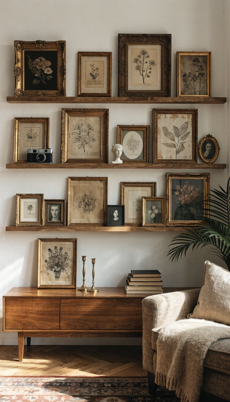
No commitment to a hundred nail holes? Picture ledges let you layer and swap art on a whim. It’s part gallery, part bookshelf, and all kinds of cozy.
Setup
- Install 2–3 ledges stacked vertically, spaced 12–16 inches apart.
- Layer small frames in front of larger ones for depth.
- Mix in objects: vintage cameras, brass candlesticks, ceramic mini busts.
Perfect for renters and mood-shifters. You can restyle seasonally without repainting or crying over spackle.
4. The Centered Statement With Support Crew
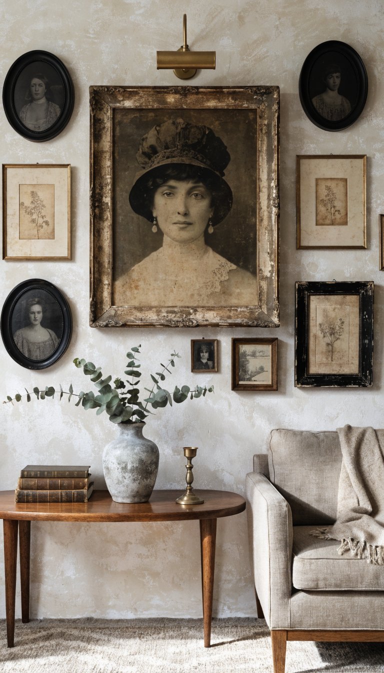
Start with one bold, vintage hero—maybe a timeworn landscape or a giant sepia portrait—then cluster smaller frames around it. The star gets the spotlight, the supporting cast adds texture.
How-To
- Hang the hero first at eye level.
- Build outward in a loose oval or diamond shape.
- Repeat at least one element (like black oval frames) 2–3 times for rhythm.
Reach for this layout when you have one piece you love and want everything else to orbit around it. FYI: It slaps above a console or sofa.
5. The Timeline Strip (Chronicles Of You)
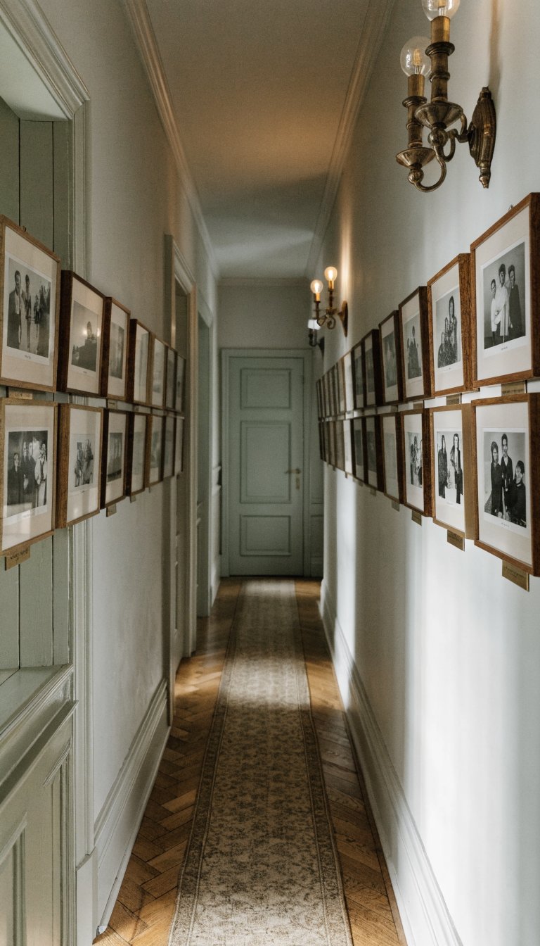
Turn your hallway into a vintage time capsule. Arrange photos chronologically in a single horizontal line—family portraits, travel snapshots, wedding polaroids—framed in aged brass or teak.
Key Points
- Keep the center line straight with a laser level.
- Use consistent mat sizes to keep things tidy.
- Add small captions or dates with a label maker for museum vibes.
Ideal for narrow spaces where a big cluster feels cramped. It tells a story, fast, and feels personal without getting messy.
6. The Shape Game: Oval And Round Remix
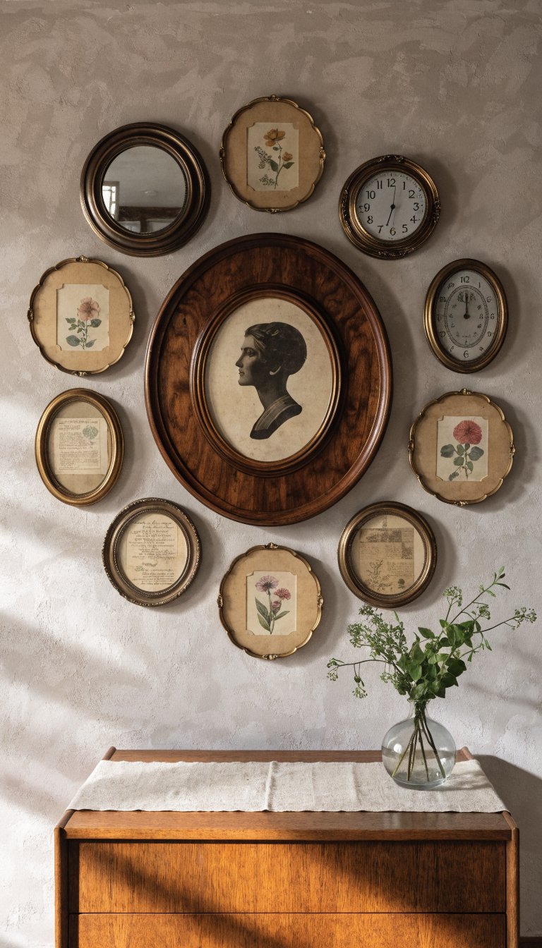
Vintage frames love curves—ovals and rounds soften straight-lined furniture and architecture. Mix cameo silhouettes, convex mirrors, and small circular botanical prints for a charming, old-world collage.
Materials
- Oval portrait frames (think walnut or gilded).
- Small round mirrors or barometers.
- Paper ephemera in oval-cut mats.
Try this when your room feels too boxy. The curves add movement and a little romance, IMO.
7. The Mantel Moment: Layered And Low
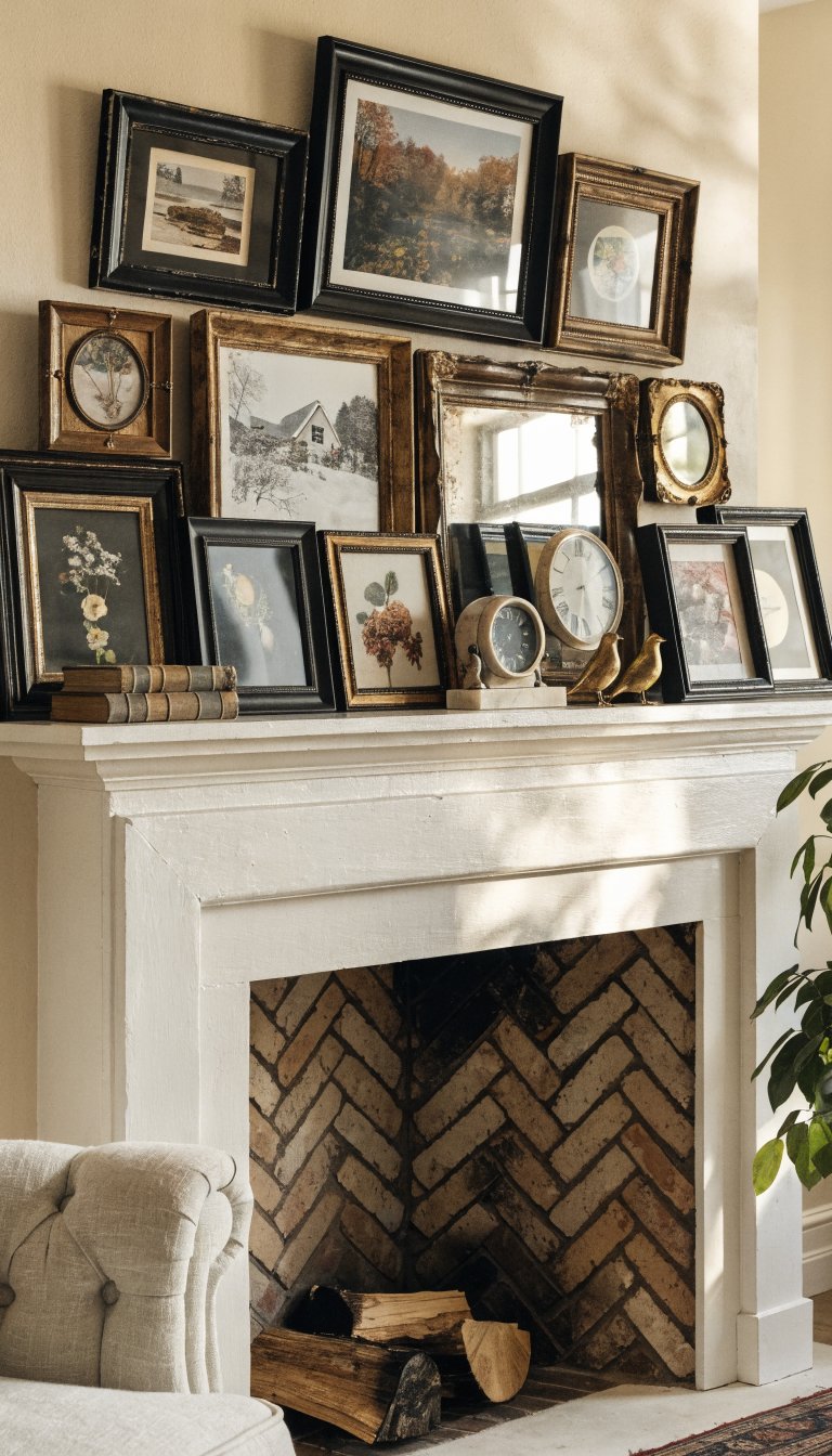
If you have a fireplace or console, use it as a stage. Lean frames against the wall and layer two or three rows, mixing heights and textures for instant depth.
Tips
- Start with the largest frame off-center, then cascade smaller pieces.
- Slide in a vintage mirror to bounce light and open the space.
- Use a few sculptural objects—brass birds, antique books, a marble clock.
Great for commitment-phobes and serial rearrangers. You can tweak this weekly and it always looks intentionally undone.
8. The Color-Story Cohort
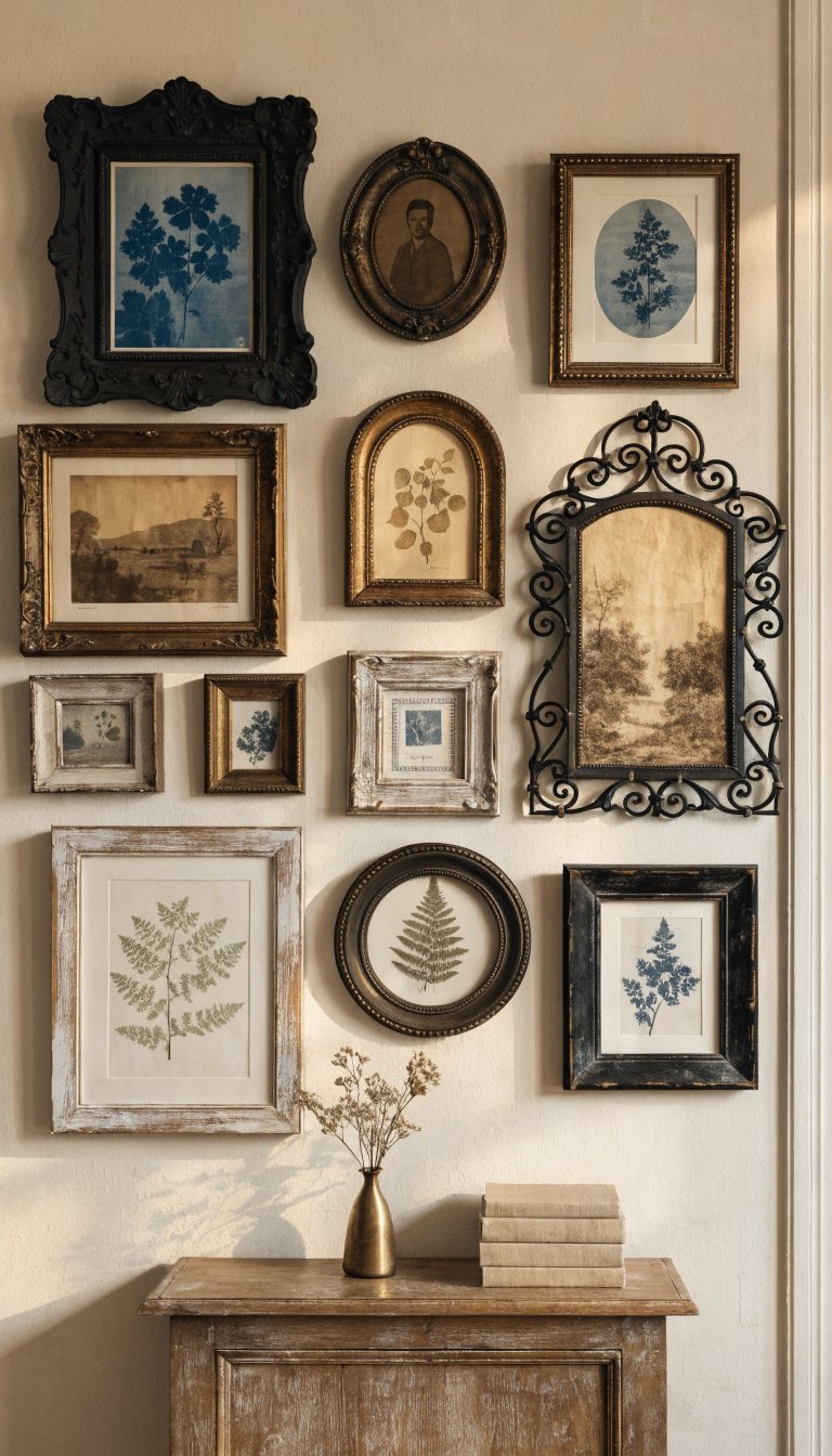
Pick a tight color story for your art—think indigo cyanotypes, tobacco browns, or muted sage botanicals—and let the palette tie mismatched frames together. The harmony feels curated, not chaotic.
Build The Palette
- Choose 2–3 dominant hues and 1 accent metal (brass or blackened iron).
- Use white or cream mats to keep things breathable.
- Slip in one textured piece—embroidered sampler, pressed fern—for depth.
Use this when your frames vary wildly. The shared color language pulls everything into a cohesive, calm arrangement.
9. The Staircase Flow That Actually Flows
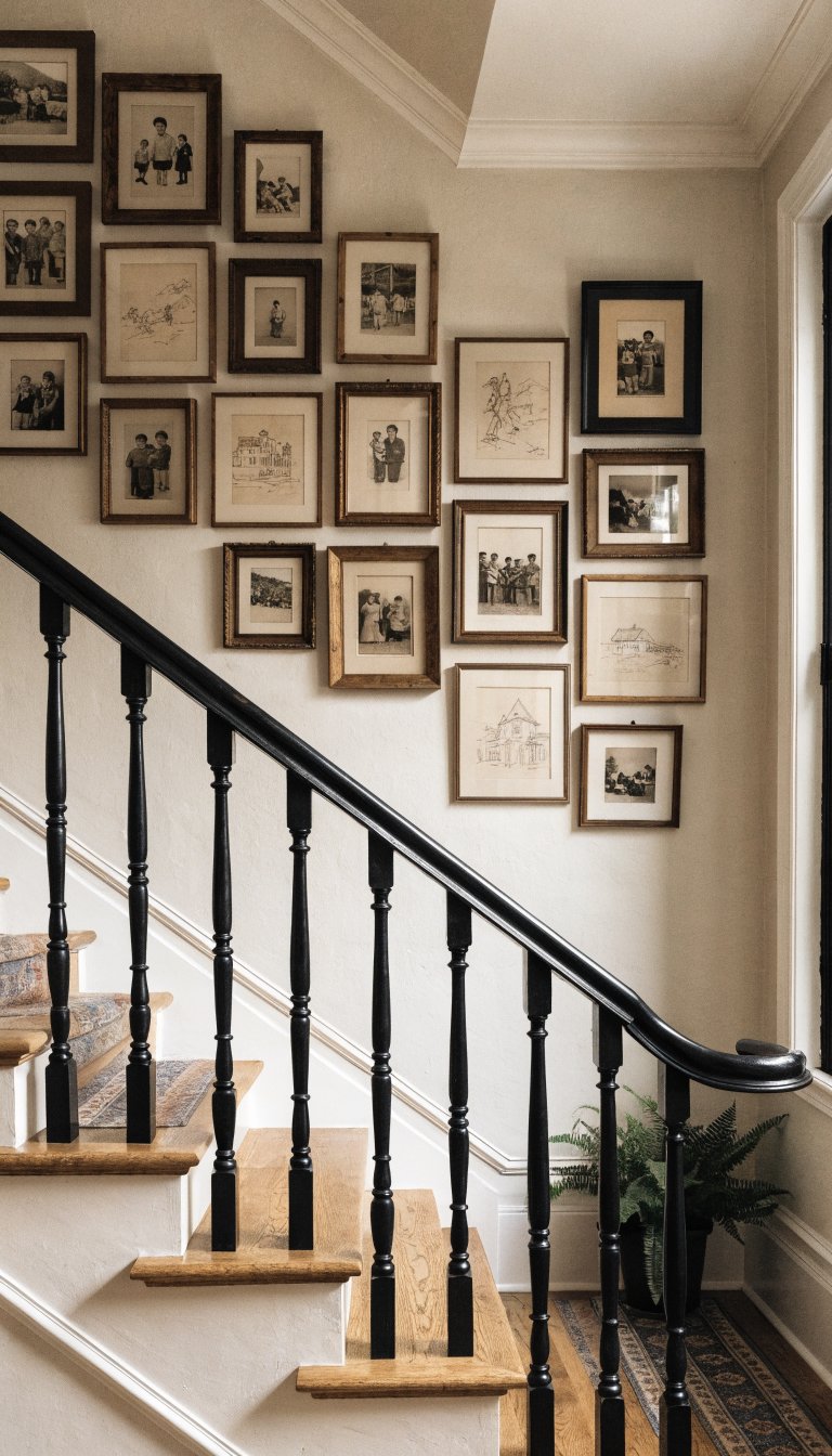
Stair walls beg for a diagonal layout that follows the rise of the steps. It looks custom, and it makes those awkward walls finally earn their rent.
Execution
- Set a visual baseline that climbs with the stairs at the same angle.
- Stagger frames above and below that line for movement.
- Repeat sizes in a rhythm (small-medium-large, repeat) so it reads as one composition.
Pick this to turn a transition zone into a gallery. It’s dramatic, practical, and lovely with vintage family photos or travel sketches.
10. The Eclectic Grid—Rules, But Make Them Flexible
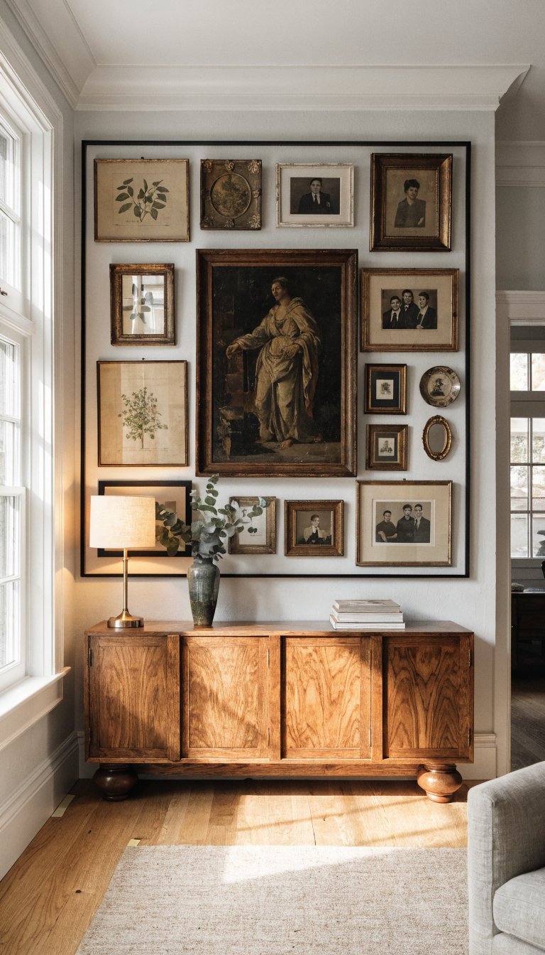
Can’t choose between strict grid and freeform chaos? Do an eclectic grid: keep outer edges clean and square, then play with mixed sizes inside the perimeter. It gives you structure and spontaneity.
How To Nail It
- Start with a taped rectangle on the wall to define the boundary.
- Place the heaviest piece near the center-left or center-right for energy.
- Fill gaps with mini frames, plates, or small mirrors to stitch it together.
Choose this when you want modern polish with vintage soul. It adapts to weird wall sizes and looks curated without feeling uptight—trust me.
Pro Sourcing And Styling Notes
- Hunt for patina: foxing on prints, aged mats, and wavy antique glass add soul.
- Unify with repetition: echo one element—mat color, frame finish, or shape—across the layout.
- Use museum putty and two hooks per frame for straight lines and fewer wonky angles.
- Test with paper templates first so you don’t play hole roulette.
Ready to play curator?
These 10 layouts turn random finds into a story-packed wall that feels collected, not cluttered.
Start with the one that fits your space, mix in pieces you love, and let your walls brag a little. Your home will thank you—and your guests will ask for your source list, guaranteed.